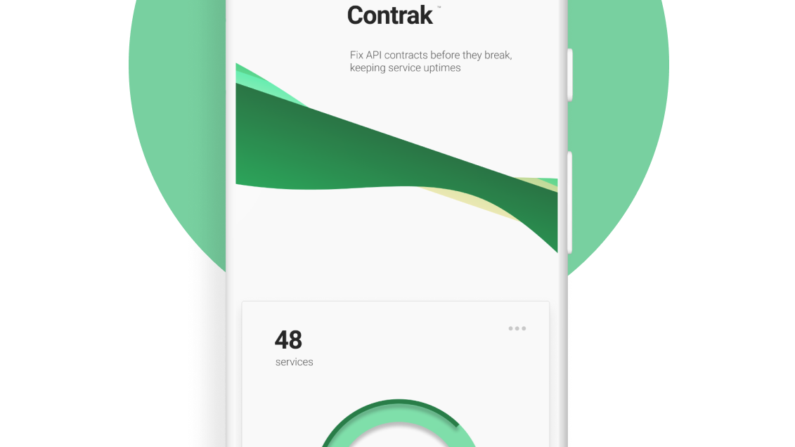
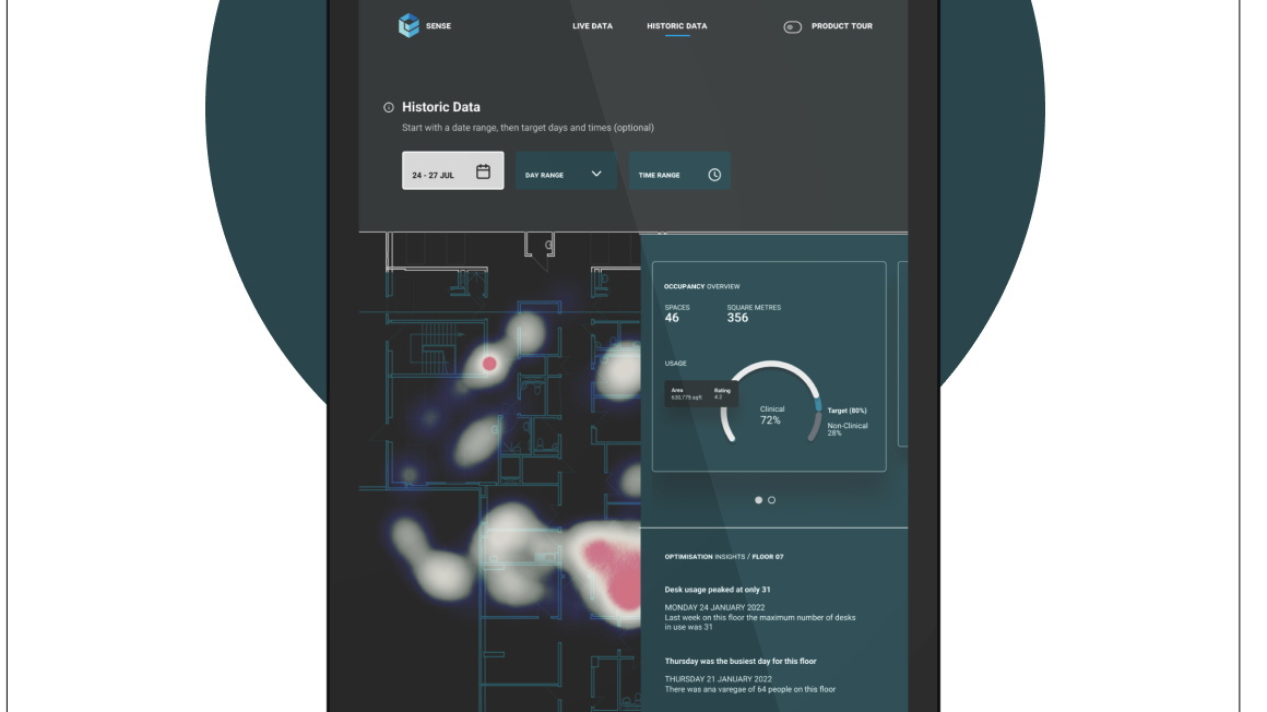
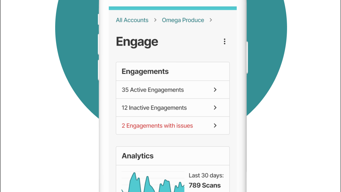
Rounds of iterative wireframes
User comprehension score
The products to be redesigned were backend-driven propositions with little or no intentionality in the UX. In the redesign best practices were deployed for better data integrity - that being a key business goal.
We went from the users battling with this (the legacy app)
Ouch.
Clean, modern consumer-grade UI with motion and interaction feedback - yes, even for B2B
Jira is fine for when you are in the delivery/implementation phase, but prior to that it is not the best way to visualise a release plan and share it with a cross-functional delivery team.
Pre-implementation Jira challenges;
- Cross-functional teams are siloed across different workspaces/projects
- Licencing barriers and Admin restrictions
- Difficult to visualise dependency relationships
- Release scheduling is constricted by sprint structure
To resolve these issues we use a lightweight visual story-mapping tool that can bounce pre-stories across to Jira (as epics) - once alignment has been reached. It's critical to visually expose dependencies, which can get lost inside a Jira workspace view.
Creating a release schedule pre-Jira is one of the best ways to ensure shipping discipline and to make sure that any rescoping doesn't negate the delivery of a vertical slice of value. It also helps to define capability-driven roadmaps, integrate personas and create high-level user stories with first-pass acceptance criteria.
Story-mapping before we get into Jira, to expose dependencies and maintain release integrity
Integrating personas really helps to stay user-centred
💠 UI affordances needed to be clear(er)
💠 Interaction state styles can't clash (ours did, at first)
💠 Basic accessibility is non-negotiable, even if it's a new thing
💠 Desktop-first is a strategic risk
💠 Sales being the gatekeepers to customers is problematic for research
💠 Business wants SaaS, but not fully committed to product-led growth
💠 Onboarding should be planned for without huge cost (e.g. 3rd party)
Long input forms require that main actions (Save) are sticky, to reduce repeated scrolling
Modern research
Supporting the UR team with Miro assets (post-it tagging, AI synthesis, UT capture templates, metrics) we prioritised understanding the users conceptual model of the current system.
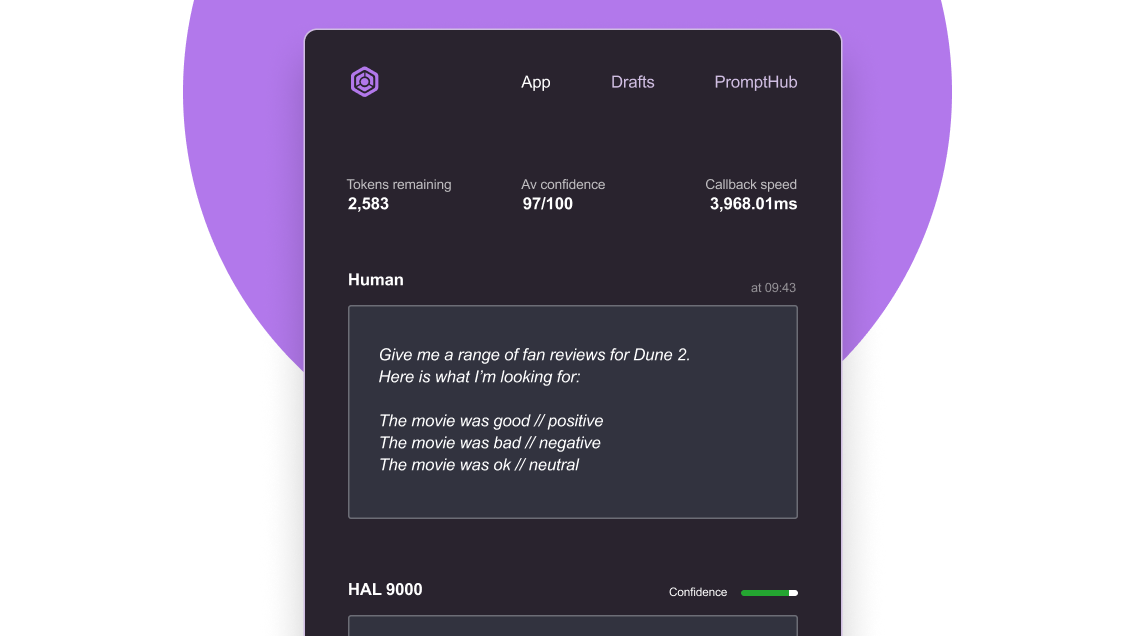
I also supported the research team in demoing no-code AI resources to them (Speak AI) and training them on prompt engineering to get closer to the insights, much faster.
Modernising the research effort with AI for raw qualitative dataset analysis
Letting users rename things offers them flexibility, but also encourages poor data hygiene
Our research Miro bards were getting messy, so I built a reusable template to capture feedback
Face it, head-on
We mapped the data and collaborated with the Solutions squad to co-assess Salesforce workflows, analysing the unstructured non-hierarchical data making sure we were showing users and stakeholders something that's actually feasible.
Data and flow mapping were critical. Salesforce was the backend which proved challenging.
UX can be a new thing for a lot of organisations so you might need to adapt your approach to remove interpretation and define a systematic model that can be aligned on.
Gaps in the PMO meant we needed a defined delivery structure, for clarity.
Feedback from other designers (plus developers and PO's) was very positive and validated that there had been a gap in the understanding of what patterns to use, why and when.
These simple pattern wireframes each come with a side of metadata to indicate the volume of data the designer might be dealing with, and how that should be relative to the choice of pattern you might go for.
Designers need a hand when picking patterns otherwise they just freestyle it, dev goes nuts
Usability evaluations with unmoderated testing, via useberry app
The benefits of giving components in Figma alias names
Breathing space in the UI is critical, and we learned that our input field stroke was initially too thin
Character counters on fields avoids frustration and gets users thinking about naming conventions
Micro-copy, motion and colour signalling can combine to make an interaction language that users learn quickly
Tasked with delivering search and filtering designs (for large-ish datasets) I researched and decided that the Airbnb search model would be smart to work from given they've already done a ton of user testing around it, no doubt!
💠 Prefiltering matches indicator (the UX juice)
💠 Sticky CTA's, designing for scale
💠 Touch-friendly vertical spacing
💠 Side-sheet interaction, a low friction/widespread consumer-known pattern
💠 Elastic Search powering the backend
Static facets pattern with potential matches shown - better than a lucky dip approach
To push the model hard the squad doubled the volume of training data it consumed and ensured that sample data payloads were properly representative of the actual data.
From research we had learned that supporting contextuality was needed for users to make an informed decision on whether to interact with a result, or not. We had shifted the effort from the user to the system, letting the tech do the hard work instead.
Targeted, faster results beats volume
That wider contextual approach proved valuable to users. At three character input the search would go and fetch for matches, then return a limited set of results at lighting fast speed.
This UX technique brings the user straight into task-behaviour, avoids having hundreds of paginated results and returns a much tighter, targeted set of results.
